"
Class Notes Calculus I
The Derivative Function
A series of text problems in section 2.3 task for graphs of the derivatives of pictured
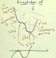
functions. One such function is shown below. We wish to graph the derivative of the
function whose graph is shown in blue.
We first orient ourselves to the situation by noting that the derivative is represented
by the slope of the graph. So we need to determine things like for the slope is positive,
where it is negative, where it is 0, where its magnitude is large and where its magnitude
is small.
We first note that the slope seems to be 0 at two points, one where the graph seems to
level off as it decreases before continuing to decrease further, and once where he reaches
its minimum altitude. These points lie along the vertical dotted red lines. To the right
of the second dotted red line the graph is increasing so the derivative must be positive.
To the left of this line, except at the first dotted red line, the graph is decreasing so
the slope is negative, and we conclude that the derivative is therefore negative.
We note that as we move from left a right, the slope of the graph begins is a large
negative slope, corresponding to a large negative derivative. The slope becomes less and
less drastic, gradually approaching 0 while still remaining negative. This is expressed on
the graph of the derivative shown in green below the blue graph: the value of the
derivative starts with a relatively large negative value, and gradually approaches 0.
After first reaching zero, the derivative again becomes negative, approaching a maximal
steepness corresponding to a large negative value of the derivative before returning to 0
again at the low point of the blue graph. This is indicated by the green graph, which
declines to a minimum value corresponding to the point of the blue graph's maximum
negative steepness, then back to 0.
The slope of the blue graph then increases, corresponding to an increasing derivative
and an increase in the values represented by the derivative graph.

If we think of the graph of the
original function as representing the depth of water in a cylinder as a function of clock
time, we see that the water level starts out by decreasing rapidly, then less and less
rapidly until it momentarily stops, only to begin decreasing again more and more rapidly
for a time. The rate of decrease then slows and the decrease eventually stops, giving way
to a gradually increasing rate of depth increase.
The blue graph shows this behavior by its slopes. The green graph shows this behavior
by its vertical coordinate. It is possible to look at either graph and follow the above
description. You should do so, and observe how the graphs give you identical information
about the rates at which depth changes.
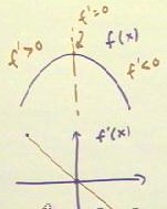
If we wish to graph the derivative function f'(x) corresponding to the function f(x)
whose graph is given in blue below, we note that the slope begins as positive and
gradually decreases to 0 at the high point of the graph before decreasing into
increasingly large negative values.
As a result the graph of f'(x) will be decreasing. If f(x) has a parabolic graph then
it is quadratic and its derivative will be linear, and the graph of f'(x) might well look
like the one shown. If f(x) is not quadratic then the graph of f'(x) will not be linear,
but it will still decrease from upper left to lower right.

A depth vs. time interpretation
of the graph of f(x) reveals an initially rapid increase in depth. The rate of increase
gradually slows as the depth approaches its maximum value, after which the depth decreases
at a steadily increasing rate. The same description can be red with the f'(x) graph, where
it is understood that the y values represent rates of change of depth.
Video Clip #1
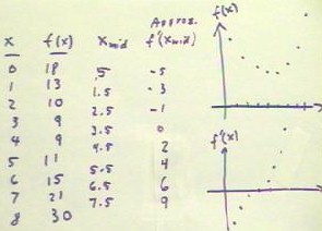
The table below for f(x) vs. x can be used to obtain an approximate set of values for
f'(x). For each x interval we calculate `dy / `dx, where `dy is the change in the value of
the function f(x). We did this with our depth vs. time data. The most appropriate x value
to associate with each `dy / `dx, at least in first approximation, is xMid, the midpoint
between the two x values between which the average rate was calculated. Our table thus
shows f'(xMid) vs. xMid, and these columns are plotted in the f'(x) graph to the right.
The values of f'(x) corresponding to each of the given x values could be estimated by
sketching a smooth curve through the points of the f'(x) graph and using this curve as a
basis for the estimates.

Video Clip #2
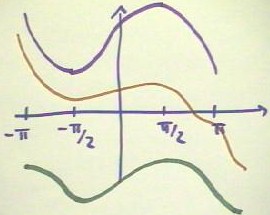
A text problem asked for a graph of the function which had it positive derivative
between -`pi / 2 and `pi / 2, derivative zero at these two x values, and negative
derivative from -`pi to -`pi /2, and from `pi/2 to `pi. To sketch such a graph we might
start at -`pi and sketch a curve with an initial negative slope which then gradually
approaches 0 at -`pi / 2. The slope then becomes positive and the graph increases until it
again levels off at `pi / 2, after which the graph decreases at least until we reach `pi.
The figure below shows 3 such possible graphs. Note that we can start at any y value,
and that we need not make any assumptions about just how the derivative changes over any
interval, as long as the prescribed behavior is followed.

Section 2.4 deals with interpretation of graphs, and especially with interpretation of
derivatives. You should already be familiar with the idea of representing a derivative as
the rise / run of a graph, and interpreting the meeting of the derivative by interpreting
the meeting of the rise in the run.
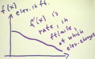
The graph below depicts the elevation in feet of the Mississippi River as a function of
the distance x from its source. The slope of this graph represents rise / run = change in
elevation in feet / change in position in miles. The derivative therefore expresses the
rate, in feet/mile, which elevation changes.

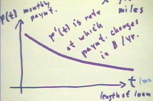
If P(t) represents the monthly payment on a loan, where t is the number of years over
which the loan is to be repaid, then clearly the monthly payment will be less if repayment
is spread out over a greater number of years. The graph will therefore look something like
that shown below. The rise of this graph represents the change in the monthly payment in
dollars, while the run represents the change in the length of time in years over which the
loan is to be repaid. An average slope between two points on the graph will therefore
represent the change in monthly payment per year of loan length, in dollars per year. The
derivative therefore represents the rate which the payment changes in dollars per year.

Video Clip #3
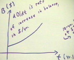
If B(t) is the balance in an
account which is earning interest compounded a fixed rate, then a graph of B(t) in dollars
vs. t in years might look like that shown below. Between any two graph points the rise
represents the change in the balance in dollars, and the run represents the change in time
in years. The slope therefore represents the number of dollars per year by which the
balance is changing at any given time t.

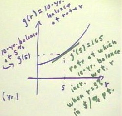
Suppose you invest a certain amount of money at interest rate r. Then the higher the
interest rate the more money you will have at the end of a 10-year period. g(r) represents
this 10-year balance as a function of the interest rate r. In this case, g(5) would
represent the 10-year balance at a 5% interest rate.
A slope on this graph represents the change in your 10-yr. balance in dollars, divided
by the change in the interest rate in percentage points. This slope thus represents the
number of dollars per percentage point by which the 10-year balance would change.
g'(5) = 165 would therefore indicate that the increase per percentage point in the
10-year balance, based on an initial 5% interest rate, would be $165 per point. Thus, for
example, and interest rate increase from 5% to 5.1% would entail a change in rate of .1
point and, at $165 / point, a difference of $16.50 in balance. (Of course, the balance
would increase by slightly more than $16.50, since as the graph shows the rate would
increase slightly. You should make yourself a note to review the differential and the idea
of predictor-corrector methods within the context of this problem.).

Video Clip #4
"
