Precalculus I Class 01/30
If y = .01 t^2 - .5 t + 80 then
what happens to depth y between t = 10 and t = 20?
depth y changes from y(10) = 76 to y(20) = 74.
We might assume that this means that depth changes from 76 cm to 74 cm as t changes from 10 sec to 20 sec.
what therefore is the average rate at which y changes with respect to t, between t = 10 and t = 74?
Average rate of change of quantity A with respect to quantity B is
ave rate = change in A / change in B.
Ave rate of change of y with respect to t is therefore
ave rate = change in y / change in t
Change in y is final depth - initial depth = 74 cm - 76 cm = -2 cm.
Change in t is final t - initial t = 20 sec - 10 sec = 10 sec.
Therefore
ave rate = change in y / change in t = -2 cm / (10 sec) = -.2 cm / sec.
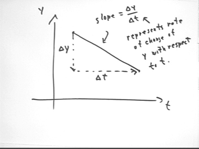
These calculations can be represented on a graph of y vs. t.
On a y vs. t graph, slope = `dy / `dt, where `dy is the change in y and `dt the change in t from one graph point to another so that `dy / `dt represents rise / run..
The slope of a graph of y vs. t therefore represents rise / run = change in y / change in t, which is the average rate of change of y with respect to t.
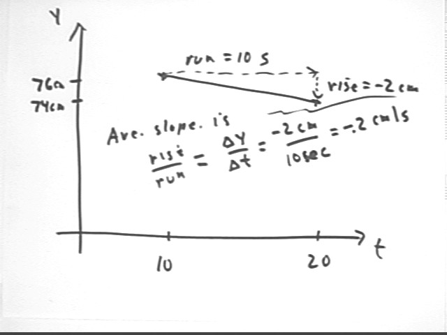
The graph points corresponding to the y vs. t information for the function given above are (10, 76) and (20, 74).
From the first point to the second the rise is -2 cm and the run is 10 sec.
It follows that the slope of a straight line segment between these points is -2 cm / (10 sec) = -.2 cm/s.
This calculation is identical to the calculation of the average rate of change of y with respect to t.
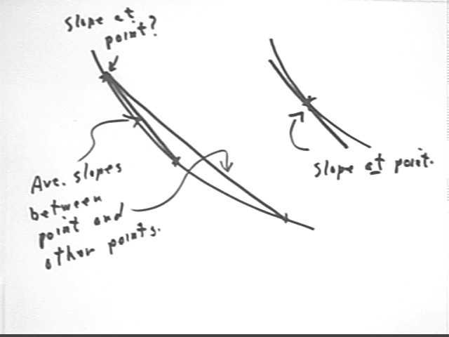
We can also ask the question 'what is the slope of a curve at a single point'?
Slopes so far have been calculated between points, always using two points so that we have a rise and a run.
If we want to find the slope at a single point we don't have the two points we need to get a rise or a run.
The larger curve in the figure below shows a point. Two segments are indicated, both originating from this point and each ending at another point on the curve. These segments are called secant lines. A secant line is a line segment connecting two points on a curve.
The longer secant line lies further from the curve than the shorter. So in some sense we might think that the slope of the shorter secant line is somehow closer to the slope at the indicated point.
If we take secant lines over a series of points approaching the single point at which we wish to find the slope, we might expect the slope of the secant line to somehow approach the slope of the curve at that point.
The smaller curve shows a point and a line tangent to the curve at that point.
The tangent line intersects the curve only at that point.
The slope of the tangent line is what we mean by the slope of the curve at the point.
As you will see in calculus, if the curve doesn't have any weird behavior near the point, the slope of the tangent line will indeed be the limiting value of the slopes of secant lines between the given point and a series of points approaching that point.
More specifically if P is a point on a 'nicely behaved' curve, the slope of the tangent line at P will be the limiting slope of a series of secant lines PQ, where Q is a point on the curve which we think of as approaching the point P.
We observed how the position of a hanging doorspring changes as we add water to a container supported by the spring. Each 'cup' was in fact a 20-oz soft drink container full of water.
Spring data:
| Spring Position (cm) | # cups of water |
| 5.2 | 0 |
| 5.4 | 1 |
| 13.5 | 2 |
| 24 | 3 |
| 34.5 | 4 |
| 45.8 | 5 |
We can graph y = # of cups of water vs. x = spring position. We obtain the following graph.
Note that the data point (5.2, 0) does not follow the pattern of the remaining points and has been omitted from the graph.
The reason for this anomalous point is that the spring was originally coiled tightly on itself, and it takes a certain amount of force before it will start to lengthen. A 1 kg weight was already suspended, in addition to the container, and that weight was not sufficient to lengthen the spring. Most of the first 'cup' of water added had no effect on spring length. The last little bit of water in that first cup did manage to lengthen the spring by .2 cm.
We author the data into DERIVE using the format [[5.4, 1], [13.5, 2], [24,3], [34.5,4], [45.8,5]] then set the plot range to run from -5 to 50 on the horizontal and -1 to 7 on the vertical axis. Plotting the point we get the following:
Spring graph of y = # cups vs. x = spring position.:
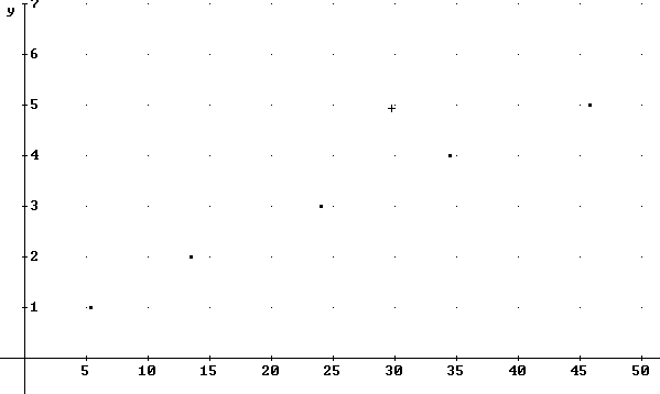
It appears that after the spring starts stretching the points tend to lie on or close to a straight line.
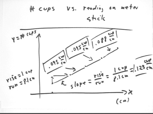
To see if the line is indeed straight we can calculate the point-to-point slopes, as indicated in the figure below.
The first segment runs from (5.4 cm, 1 cup) to (13.5 cm, 2 cups), having a rise of 2 cups - 1 cup = 1 cup and a run of 13.5 cm - 5.4 cm = 8.1 cm.
The slope of this segment is therefore 1 cup / (8.1 cm) = .123 cup / cm. This calculation is shown on the figure.
The remaining slopes, calculated in a similar manner, are .095 cup / cm, .095 cup / cm, and .088 cup / cm.
It appears that the slopes have a definite downward trend.
For an ideal spring the slopes would be unchanging, within the limits of accuracy of our experiment (e.g., we can't read the meter stick to less than .1 cm and those bottle might not all have been completely full; there might also have been some spilling in the transfer).
The slopes represent average number of cups required to stretch the spring an additional centimeter. For this real-world spring it appears that it takes a smaller and smaller fraction of a cup to stretch the spring by each succeeding centimeters. In a sense the spring seems to therefore weaken a bit as it is stretched out.
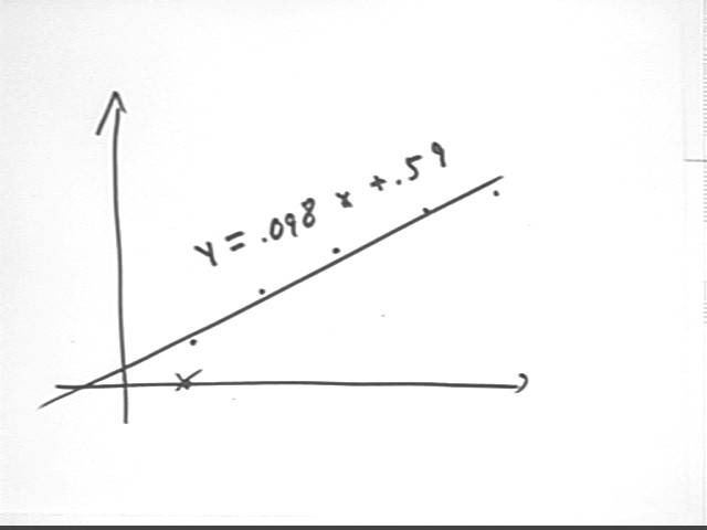
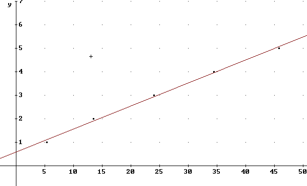
Authoring the command fit([x, mx+b], [[5.4, 1], [13.5, 2], [24,3], [34.5,4], [45.8,5]]) and simplifying we obtain the expression 0.09791738004·x + 0.5873157556.
This expression indicates that the 'best-fit' straight line for our data is y = 0.09791738004·x + 0.5873157556, or rounding off to a reasonable number of significant figures y = .098 x + .59.
Plotting this equation we obtain the straight line shown below along with the original data.
We observe that the data start out below the line, rise above the line, the at the end fall below the line once more.
This below-above-below behavior corresponds to the decreasing slopes we observed earlier.
The sketch below labels the line and slightly exaggerates the 'below-avobe-below' behavior of the graph.
The x through the point on the x axis indicates that we have omitted from our model the point (5.2, 0), which as you recall indicated the spring length while the spring was still tightly coiled.