Error Bars
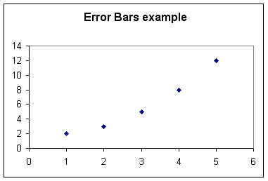
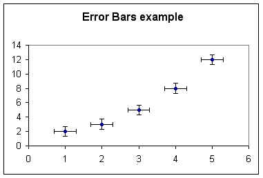
Suppose that the data in the graph below has an
estimated error of +-.3 in the x direction and +-.7 in the y direction.
We draw 'error bars' as indicated, representing the
maximum and minimum possible values in the x and y directions.
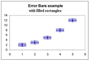
We can then draw rectangles indicating the full
range of possible x and y values corresponding to each data point.
The data seems quadratic in nature, with a definite
curvature.
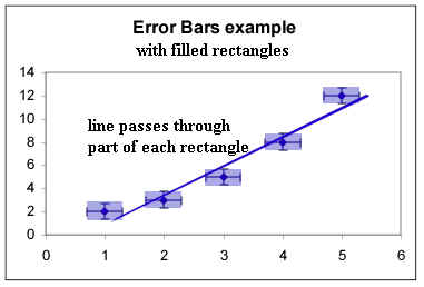
- However, it is possible to draw a straight line that
passes through each rectangle.
- We therefore cannot conclude that this data set is
not linear, though because of the way the points start above the line, dip below then end
up above again we would be justified in thinking that it is not likely to be linear.
- If the error bars were smaller, corresponding to
more accurate observations, we would be unable to fit a straight line and would therefore
conclude that the data do not support the hypothesis of linearity.