Experiment 3 Questions and Comments
Question 1: Plotting Quantity 2 vs. Quantity 1
I'm working on Experiment 3 and I'm not exactly
sure what you are asking for regarding the first graph we are asked to construct.
- The instructions say to plot the average velocity on
the second ramp vs. the average velocity on the first.
- I plotted my data for each ramp and made two
separate lines.
Am I on the right track or not?
Answer:
As with the pendulum experiment, when you plotted
period vs. length, you plot data points on a coordinate graph.
- When you plot Quantity 2 vs. Quantity 1, Quantity 2
goes on the vertical and the value of Quantity 1 on the horizontal axis.
- So your points would have 1st ramp velocity as the
'x' and 2d ramp velocity as the 'y' coordinate.
Question 2: Plotting Quantity 2 vs. Quantity 1,
Setup of Ramps
I have Physics 121, Experiment 3 underway but I
don't know how to proceed with your assignment of plotting the average velocity on the
second ramp vs. the average velocity on the first, for each distance on the first ramp.
- I think I'm supposed to do a calculation to combine
the two numbers but I don't know what that is.
- I tried viewing the video clip which I think tells
the answer, but ... from the clip I do think that the vertical line on the graph should be
the centimeters of 10, 15...up to 50.
- One other problem I had was that the ball simply
wouldn't complete the distance on the second ramp when I used the 10 cm. on the first
ramp!
- Can I plot the others and ignore 10 cm?
Answer:
You can understand how to do the graph in terms of
a table of data:
- Make a table of ramp 2 ave. vel. vs. ramp 1 ave.
vel. (remember the conventions from the pendulum experiment: the ramp 1 vel. is the first,
or 'x', column and the ramp 2 ave. vel. is the second, or 'y', column).
- Each data point on the table gives you the
coordinates of a point on your graph.
As to your second question:
- The second ramp is to be set up so that the ball
maintains constant velocity on it--a ball given a slight nudge should keep going without
speeding up or slowing down appreciably. Therefore, if it comes off the first ramp
with a velocity, it has to go the distance on the second ramp. It sounds like
the second ramp needs a little more 'downhill' slope to maintain constant velocity.
Comment on Fitting a Straight Line to the Graph:
The graph below (and the table below the graph)
represent ramp 2 ave. velocity vs. ramp 1 ave. velocity.
The short black line is the best-fit line to the
data.
- The individual who did the experiment estimated
uncertainties represented by the error bars.
- We see that the best-fit line has a slope of about
1.28 and a y-intercept of about 11.6.
- We also see that the best-fit line does not pass
through all the 'error rectangles'--the rectangles defined by the error bars.
- The best-fit line does not agree with our
expectation that the 2d ramp ave. vel. should be double that on the first.
- If that was the case our line would be expected to
have slope 2 and to pass through the origin.
- We plot the 'ideal' expected line in blue, thru the
origin and with slope 2.
- We see that this line passes through the rectangle
defined by the error bars of every point, so from this data we cannot rule out the
hypothesis that this is the correct line.
- In fact, this line fits the 'error rectangles'
pretty well.
It is important to understand that any line that
passes through all the rectangles defined by the error bars is a possible result of this
experiment.
- Since the slope-2 line passes through all the
rectangles, the slope-2 line is a possible result. It's not the most likely, but it
is possible.
- The slope-2 line doesn't fit the data points as well
as the best-fit line, but it's pretty close to fitting the error rectangles as well as
possible.
- You might try seeing what the range of possible
slopes is, within the restriction of passing through the 'error rectangles'. The
range probably stays pretty close to 2.
Note that it is possible to underestimate error
bounds, or to plot anomalous points, so that your data is inconsistent--i.e., so that no
line goes through all the error rectangles.
- In this case the experimental results will not be
valid, though you might still learn a lot from the experiment.
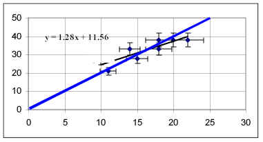
Table 2. Average Velocities for Ramps 1 and 2
Length of 1st Ramp |
Avg. Velocity on 1st Ramp (cm/s) |
Avg. Velocity on 2nd Ramp (cm/s) |
10 cm |
11 |
21 |
15 cm |
10 |
27 |
20 cm |
15 |
28 |
25 cm |
14 |
33 |
30 cm |
18 |
33 |
35 cm |
18 |
38 |
40 cm |
20 |
38 |
45 cm |
22 |
38 |