Combining Graphs by Addition, Subtraction, Multiplication and Division
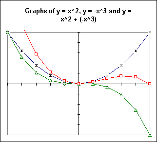
When we add two functions, we add their y values for every x value. For example the table below shows how we would add the functions y = x^2 and y = -x^3 for x values between -1 and 1:
x |
x^2 |
-x^3 |
x^2 + (-x^3) |
-1 |
1 |
1 |
2 |
-0.8 |
0.64 |
0.512 |
1.152 |
-0.6 |
0.36 |
0.216 |
0.576 |
-0.4 |
0.16 |
0.064 |
0.224 |
-0.2 |
0.04 |
0.008 |
0.048 |
0 |
0 |
0 |
0 |
0.2 |
0.04 |
-0.008 |
0.032 |
0.4 |
0.16 |
-0.064 |
0.096 |
0.6 |
0.36 |
-0.216 |
0.144 |
0.8 |
0.64 |
-0.512 |
0.128 |
1 |
1 |
-1 |
0 |
We see that the values in the x^2 column are added to the values in the -x^3 column to give the values in the x^2 - x^3 column.
A graph of this process is informative:
We see that for each x, the point on the y = x^2 + (-x^3) graph (red, table points marked with squares) is obtained by adding the y values from the graphs of the y = x^2 (blue, table points marked with x's) and y = -x^3 (green, table points marked with triangles) functions.
You should identify every point corresponding to a graph point. You should also see the following things clearly:
how the red graph (square marks) is higher than the blue graph (x's) when the green graph is positive, and lower when the green graph becomes negative
how the red 'squares' graph never lower than the green 'triangles' graph at any point because the blue (x's) graph is numbers negative
how the red graph is higher than the green graph by exactly the height of the blue graph.
Note also how the red graph is seen to represent a polynomial with zeros at x = 0 and x = 1, with the x=0 zero of multiplicity 2. Since y = x^2 + (-x^3) is a polynomial of degree three, these must be the only zeros. In fact, the polynomial must factor into (x-0)(x-0)(x-1). You should verify that this is so.
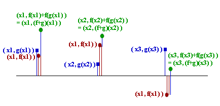
The sketch below depicts the process of adding two function values at x = x1, x = x2 and x = x3. At each x value the point on the graph of the function g(x) is indicated by a square (blue) mark, and the point on the graph of the f(x) function slightly offset to its right by a round (red) dot. Offset slightly to the right of this point is a round (green) dot representing the value of f(x) + g(x). A line runs from the x axis to each point, representing the displacement of the function from the x axis. The displacement corresponding to the f(x) + g(x) value is also indicated and is the sum of the (positive and/or negative) displacements of the f(x) and g(x) functions.
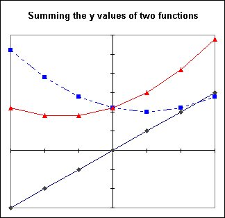
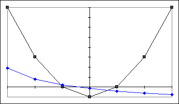
The graph below shows the sum of the black (diamond-marked) and blue (square-marked) graphs as the red (triangle-marked) graph. You should again validate this graph by verifying that the points add up as they should.
Note that when the 'diamond' function is negative, the sum 'triangles' function is less than the 'squares' function; when the 'diamond' and 'squares' functions are both positive, the sum is larger than either; and the larger the 'diamond' function the higher the sum is above the 'squares' function.
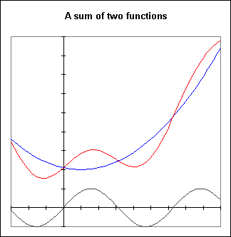
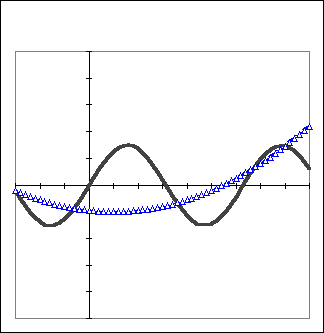
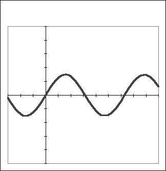
The graph below shows the sum of a 'sine-wave' function, which oscillates regularly above and below the x axis, and a parabolic function. You should be able to identify these graphs easily.
At those x values where the sine wave passes through the x axis, the sum function will be obtained by adding 0, the y value of the sine function, to the value of the parabolic function. The result will clearly be a y value equal to that of the parabolic function. So at these zeros of the sine function, the graph will coincide with that of the parabola. Be sure you see how the sum graph coincides with the parabolic graph at the zeros of the sine function.
Between the zeros of the sine function the sum function oscillates above and below the parabola, just as the sine function oscillates above and below the x axis. When the sine function peaks, the sum graph will be at its maximum distance above the parabola, and this distance will be identical to the maximum value of the sine function. The behavior at points where the sine function is a minimum (the 'valleys' of the sine graph), the sum graph will be at its maximum distance below the parabola.
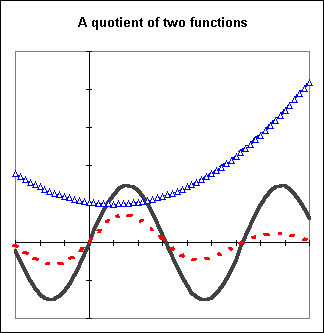
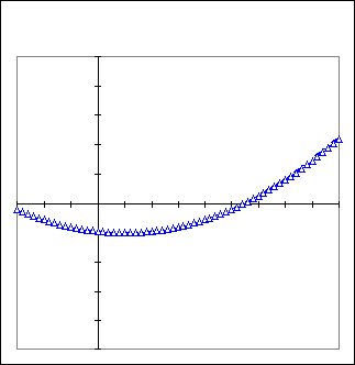
The graph below shows a quotient of two functions. The value of the sine graph is divided by the value of the parabolic graph.
Since the y value of the parabola is always greater than 1, the result of dividing the value of the sine graph (the thick black line) by the value of the parabola will always have a magnitude less than the that of the sine graph. The greater the value of the parabolic graph, the more the magnitude of the sine value will be reduced.
The red dotted graph is the quotient graph. You should see that the sine graph decreases in amplitude as the parabolic graph gets higher, corresponding to division of sine values by greater and greater parabola values.
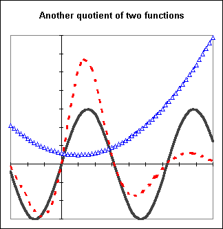
The graph below shows the same division but for a parabolic graph whose value decreases below 1. When the value is less than 1, division of the sine function by the value will give a result whose magnitude is greater than that of the sine function.
You should see clearly that while the parabolic graph is below a y = 1 line the dotted-line quotient graph is further from the x axis than the sine function graph. You should again see how the sine function graph oscillates closer to the x axis when the parabolic graph has greater values.
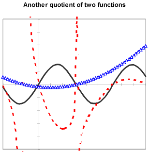
The graph below shows still another result of dividing the values of a sine function graph by the values of a parabolic graph. In this case the parabolic graph not only drops below y = 1, increasing the amplitude of the sine function for those values of x, but passes through y = 0.
As the value of the parabolic graph approaches 0, the sine values are divided by smaller and smaller numbers. The result gets larger and larger without bound. As a result the quotient graph has an asymptote at every point where the parabolic graph is 0.
When the value of the parabolic graph is less than 0, the sine values will be divided by negative numbers and will be negative. So as the parabolic graph passes through y = 0, the quotients will go from very large positive numbers to very large negative numbers, or vice versa. Be sure you see where this happens and how the quotient graph is affected.
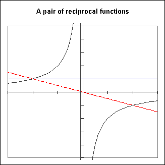
The graph below shows a pair of reciprocal functions. The line y = 1 (in blue) is shown to make make behavior of the function pair clearer, and is not part of either function. The (red) linear graph with negative slope is one function, and the curved graph is its reciprocal. If we call the function of the linear graph f(x) and that of the curved graph g(x), we say that g(x) = 1 / f(x).
It should be clear that
when f(x) is small (near zero), g(x) = 1 / f(x) will be large,
when f(x) is large, g(x) will be small,
when f(x) > 1, g(x) < 1 and
when f(x) < 1, g(x) > 1.
You should check to see that these statements are reflected in the graph.
Recall that e^x = 1 + x + x^2 / 2 + x^3 / 3! + ... + x^n / n! + ... , with the approximation improving as the number of terms increases and as x gets closer to zero.
If we add the graphs of y = 1, y = x and y = x^2 / 2, we obtain the graph of y = 1 + x + x^2 / 2. The graph below shows the four functions involved. You should validate that the sum function, represented by the heavy dotted (red) line, is in fact obtained at each point by adding the values of the three functions represented by the heavy dark lines.
The y = 1 + x + x^2 / 2 graph should be close in value to e^x for x values near 0. You should sketch on this graph the graph of y = e^x and see how it remains close to the dotted-line function for a ways but then moves more and more quickly away.
The next graph shows how the y = 1 + x + x^2 / 2 + x^3 / 6 graph results from adding the graphs of y = 1, y = x, y = x^2 / 2 and y = x^3 / 6. You should analyze this graph as you did the preceding graph.
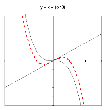
The graph below shows what happens when the y = x function is added to the y = - x^3 function.
On the left-hand side of the y axis the y = x function is negative and pulls the positive - x^3 function down. This results in some negative values between x = -1 and x = 0, where the magnitude of x is larger than that of x^3. Similar behavior appears to the right of the y axis, where the sum graph is temporarily greater than 0 before being overcome by the increasing large negative values of - x^3.
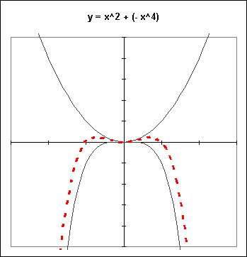
The next graph shows similarly how y = x^2 + (-x^4) can be distorted near the origin to give two peaks and a valley.
The zeros of this function are x = -1, 0 and 1, and the zero at x=0 is of multiplicity 2. The factored form of this function should therefore be something like (x- -1) (x-0)(x-0) (x-1). You should check that y = x^2 + (-x^4) indeed has this factored form.
Exercises 1-81. Make a table for the functions y = x^2 and y = -2 x^3, and their sum y = x^2 + (-2 x^3).
Sketch the graphs of these three functions on the same set of coordinate axes, and clearly indicate how the third is the sum of the first two.
2. Sketch the sum of the two graphs given below. Designate the point corresponding to each pair of marked points.
3. Sketch a graph of the sum of the two functions depicted on the graph below.
If each mark on the y axis on the graph of Exercise ## corresponds to 2 units, sketch the graph of the quotient function.
Sketch the graph that would result from multiplying these two functions.
4. Sketch the graph of the reciprocal of the function given below, if each mark on the y axis corresponds to 2 units.
How would your reciprocal graph change if each mark on the y axis stood for just 1 unit?
5. If each mark on the y axis corresponds to 1 unit, sketch the reciprocal of the graph below:
6. Sketch the graph of y = x + (-x^3 / 3!) + x^5 / 5! by first sketching the graphs of y = x, y = - x^3 / 3! and y = x^5 / 5!, then graphically adding the three graphs.
Near x = 0, this graph should resemble the graph of the sine function seen in previous examples. How far from x=0 do you have to go before the graph stops resembling that of a sine function?
7. Sketch the graph of y = x^2 - 2 x^4 by first sketching the graphs of y = x^2 and y = -2 x^4, then graphically adding these two graphs. How does the result compare to the graph of y = x^2 - x^4? How do you explain the difference?
8. Add the graph of y = x to the graph of y = x^2 - 2 x^4 (from the preceding problem) to obtain the graph of y = -2 x^4 + x^2 + x. How does the shape of the graph change?